Popon is pleased to bring you our second installment of cool POP displays, trends and ideas. Our vigorous store checking schedule presents us with numerous neat examples of designers and brands coming together to deliver outstanding promotional materials that we felt needed to be shared with our audience of dedicated POP professionals.
As always, if you are interested in showcasing some of your unique designs and applications, do not hesitate to contact us to gather more details.
Gibson Burger Turner & BBQ Lighter
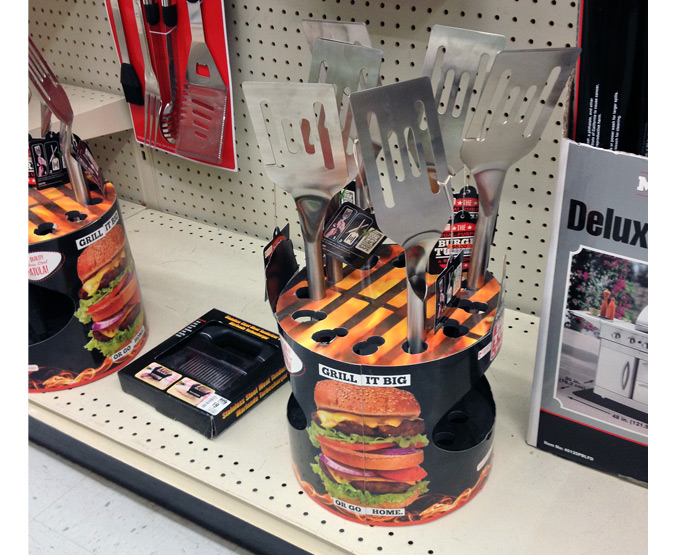
Summertime is Grillin’ time for a lot of backyard BBQr’s. In the spirit of firing up the barbie, Gibson Enterprises has launched another cool lighter design – a combo spatula and grill lighter. This stainless steel spatula has a lighter hidden in the handle to light the grill, then flip your food to perfection. Consistently known for quality, the company crafts only a few new lighter designs at a time, allowing for unsurpassed attention to detail and packaging second to none.
In addition to their unique product lines, Gibson is also know for providing great theme-based POP displays for retailers. The example shown above is a perfect combo between product and theme. The cylindrically-shaped display is decorated with a grilling surface on top and mouth-watering graphics of thick hamburgers on the sides. The 2 large cut-outs on the opposing sides serve two purposes. One, they allow visibility when loading the displays as the lighter end of the spatula rests in a vacuum formed bottom tray. Second, the cut-outs create another means of shopper engagement with the lighters.
Maybelline Angled Copy Panels Offer a Neat Twist on Utilizing Pallet Space
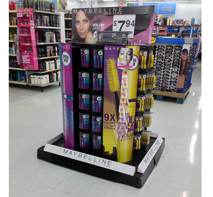
As most designers know when laying out pallet displays, one of the top priorities is to cube out the 40 x 48″ allotted merchandising space as best as possible to minimize shipping fillers and optimize structural integrity during transit. Yes, those simple rules tend to make a lot of the pallet displays you see in-store very boxy but those basic pallets tend to be more affordable due to their simplicity (components and assembly).
The Maybelline pallet above breaks those rules and adds a new twist to utilization of copy space. First off, the smaller centralized display footprint and curvy shapes add a lot of visual interest not typical with squared off pallets. Secondly, the four angled copy panels sitting on the printed pallet cover are a very cool way to use space for additional branding.
Scene-A-Rama Lets Students See the Possibilities In-Store
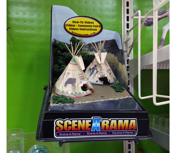
Scene-A-Rama is a popular teaching tool that enables students to build custom dioramas that are used in school lessons. Covering a wide range of topics, these miniature scenes are available in a variety of materials and subject matter across 27 different kit options.
Albeit, the diorama shown above is not your “typical” POP display, but it does serve the purpose as good, if not better than a traditional diorama shrouded in a plastic cover. Not sure how this scene got built (manufacturer or retailer) but it is quite effective as it offers full visibility and a hands-on aspect to the contents of the kit. This pre-constructed approach helps shoppers make better choices since they can see what they are getting before they purchase.
Fit & Fresh Insulated Designer Lunch Bag Displayed Using Mailing Tubes
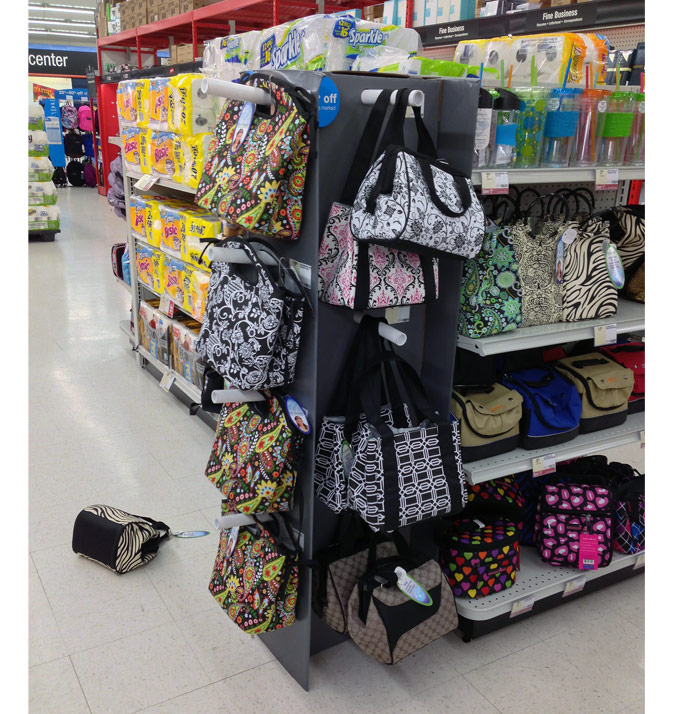
For the fashion-conscious and environmentally friendly, these designer lunch bags provide a trendy way to transport a lunch while helping out the planet (sustainable PVC free lining that keeps items cold).
Aside from all of the pretty patterns, the point of showing this display to you is for one reason……the method in which the lunch bags are presented. Not exactly lightweight, these bags required a durable method in which to display the merchandise. The decision to use spiral-wound tubes to achieve the desired results is a novel choice and one that works quite well. Note the finishing touch with the capped ends. Sometimes unconventional applications can come in handy and be incorporated into your POP displays.
Stihl Blows Into Retail With a Cool Floor Display
Founded in 1926, Stihl is the #1 selling brand of gasoline-powered handheld outdoor power equipment in America. According to the Stihl website…….from legendary chain saws, dependable trimmers, powerful blowers and industry-leading construction tools, a STIHL is designed for reliability. And built for the long haul. And that’s why so many people recommend them, and use them.
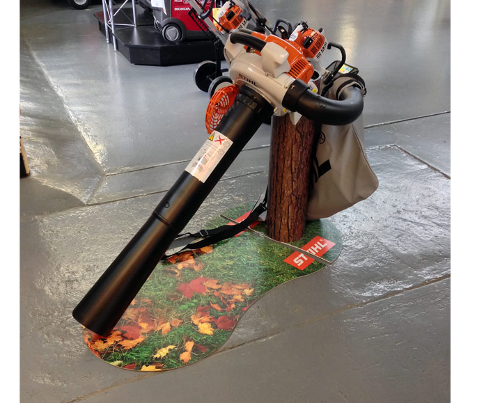
This leaf blower floor display is a solid example of creating the in-store shopper experience. The floor graphics and simulated stump are a great combination that easily puts shoppers in the right mood….not to mention the product enhancement that both elements bring to the party.
Unique Telescoping Base on Advil Tower Display
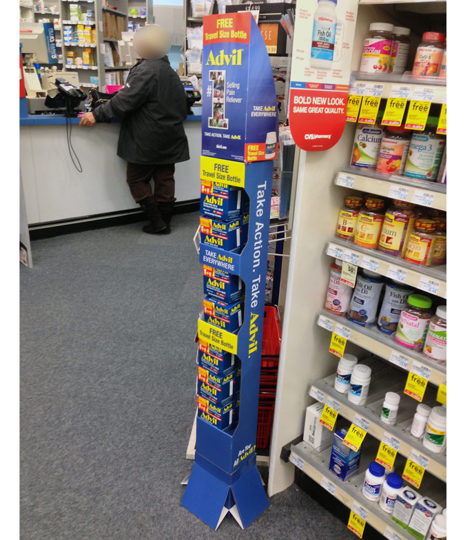
Short and sweet, we spotted a cool base that is a unique departure from the standard trapezoid-shaped bases usually associated with skinny tower displays. Didn’t examine the base too closely but it appears that the four angled side panels are able to collapse against the display then pop-out when removed from the shipping case.

