Cool blue Nivea
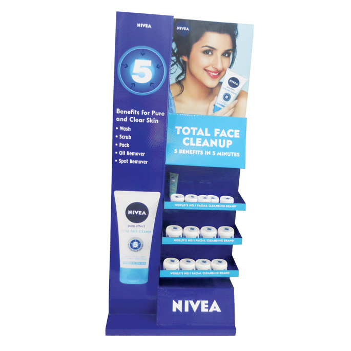
The iconic bright blue colour of NIVEA is a central aspect of the branding and this new display created by Spectrum Scan takes the color to a different level in visibility. According to Amit Shah of Spectrum Scan, “The standard blue color, which is also a proprietary colour designed specifically for the brand, is the highlight of the unit which has an impactful impression.”
The brief from the brand to Spectrum Scan was to add a vibrant color with minimum text on the branding and highlight the number 5 in the design…..five standing for the five benefits of pure and clear skin which are communicated on the right hand side of the unit.
With Parineeti Chopra as the brand ambassador depicted on the top of the unit and the brand name etched out in bold at the bottom, the unit reiterates its communication and connects with the target buyers at retail.
The unit which is made up of bubble guard, MS frame thermo form trays and eco solvent print, has three shelves which can stock 30-45 units easily. The unit was distributed PAN India.
Parachute’s Refreshing Summer Presence
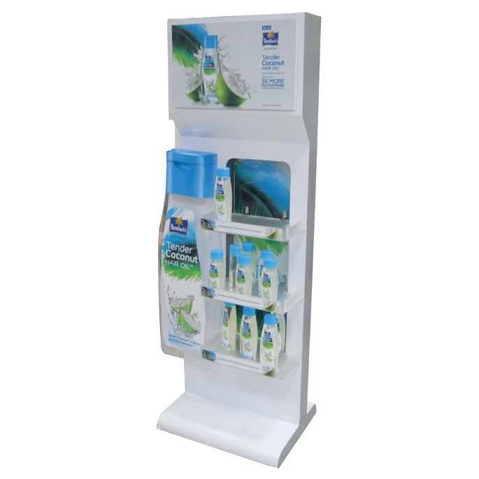
Marico Parachute highlighted their Parachute oil with a white unit at retail. The unit had top branding in Acrylic and a life size unit of the bottle on the left hand side. With three shelves, the unit can easily stock 25-30 units at one time making it high on functionality. The display, made up of wood with Acrylic shelves, looked refreshing conveying the message of the summer hair care brand with the blue and white shades adding to the freshness quotient. This unit was found in Spencer’s, Mumba.
Yippie Visibility!
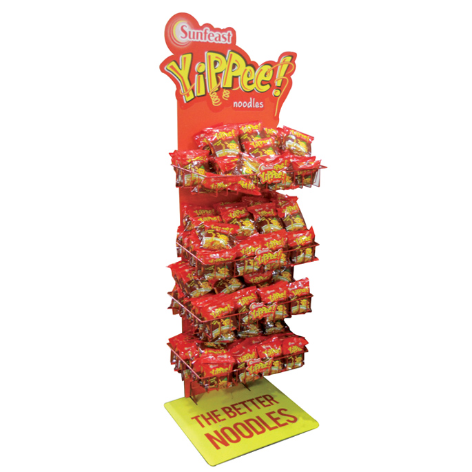
Sunfeast Yippie noodles has come up with an orange colored display made up of metal shelves and a sun board body. With branding on top and bottom communication…..’The Better Noodles,’ …..that seems to convey the product benefits rather succinctly. The spacious floor stand can stock easily 50-60 units at one time. Created by Spectrum Scan the dsplay was found in Big Bazaar Mumbai.
Tang’s Orange Bang
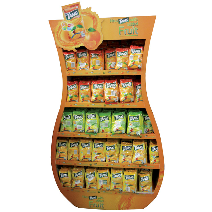
This summer Tang plays up the retail space with an orange splash. An example is this orange jug shaped display. The Tang unit, which is made up of MDF and latex printing, has five shelves and can stock up to 70-80 units at one time. This simple floor stand translates the brand’s message of “New Tang with Added Fruit” and is clearly highlighted on the top branding. Fabricated by Spectrum Scan, the display has a strong visual presence with its jugular shape and replicating jar filled with orange juice. The unit was deployed Pan India.
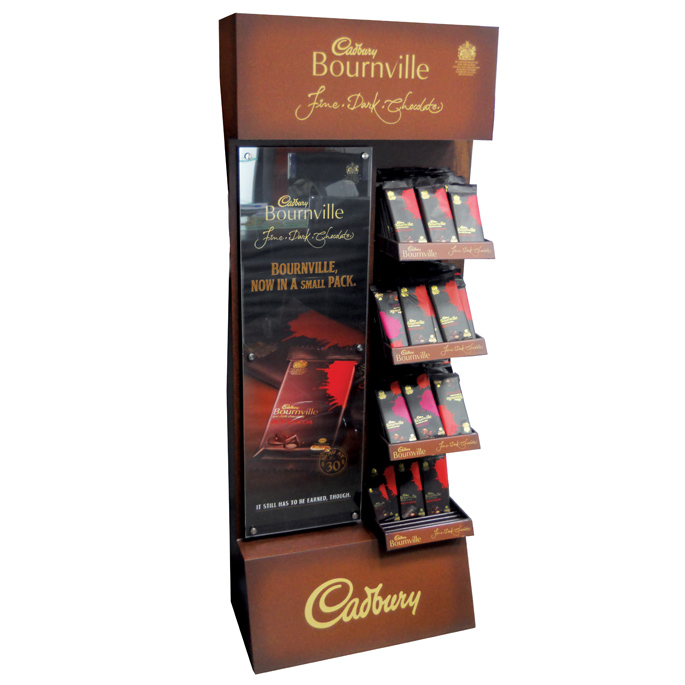
Bournville’s Rich Brown Indulgence
Made up of latext print, MDF and Acrylic branding, the brief from the brand to Spectrum Scan was to highlight Bournville’s new pack. According to Amit Shah from Spectrum Scan, “the challenge here was to create a vibrant and premium looking unit which could connote rich indulgence.” Rich brown colour was thus the obvious choice. The unit has four shelves and can easily stock 50-60 units at one go. The bottom branding of Cadbury and the top branding highlighting Bournville are hard to miss. The unit was deployed on a PAN India basis across MT outlets.

