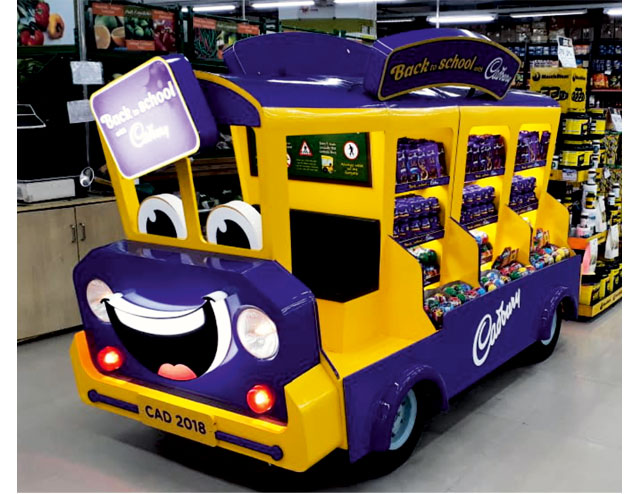
Known for creating memorable marketing campaigns, Cadbury is driving the bus on a ‘Back To School’ activation covering over 1,000 stores throughout modern trade in India. The vibrant campaign came alive with several different POP elements like end cap dress-up kits, floor standing units in the shape of school bags and larger school bus merchandisers.
“Back To School is another moment of sheer joy for kids which involves buying new stationery, new books and new lunch boxes. Mondelez India, through the BTS campaign and its delectable product range, wanted to be a part of this joyous moment and make it even more delicious through its much-loved chocolate brands. Hence, we created an in-store campaign which was highly occasion centric, joyful and engaging for moms and kids,” explains Aditya Krishna, Head – Category Planning & Activation, Mondelez India.
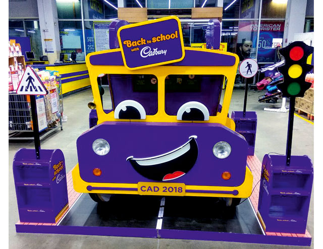
A great retail display tells your brand’s story and entices the consumer not only to stay longer, but also encourages them to interact with the product.
“Our bold purple and vibrant yellow visuals on the BTS bus display and the selfie photo booth encouraged shoppers to interact and stay engaged with the product. Typically the biggest fallout inside a store happens when either the shopper misses seeing the product in a cluttered retail environment or when the shoppers have pre-planned shopping lists. However, when we conducted shopper research in-store, the Back to School units were a clear winner. Every shopper who passed by it noticed our products, which implied that our campaign was highly effective in terms of shopper engagement at the point of buying. The Cadbury BTS initiative was a talking point with our Customers – MT chains/accounts and their top executives. This was cited as ‘Clutter-breaking initiative’ as it helped them garner footfall in their stores,” Aditya shares.
According to the brand, several global insights were researched and best practices chosen as inputs for the design & fabrication agencies. One key thing to be determined was the overall structure of the unit, which was not just meant to be relevant with the occasion, but also really stand out in-store using the chosen POP collateral. With regards to branding, the color tonality was designed to create a perfect blend of Cadbury Purple and school bus yellow to make the units bright and clutter breaking.
“From a manufacturer’s briefing perspective, we wanted them to bring the POB design to life using components like lights, animation, real elements (like wheels, seat, horn) etc,” says Aditya , adding that material quality was stressed upon to ensure strength and stability of the structure so that kids could safely play and take pictures while sitting in the driver’s seat.
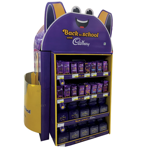
“Our brief was to make Mondelez a part of the back-to-school shopping occasion that takes place before the start of the new academic year. We needed a strong visual cue that would intuitively create an association with the occasion, break clutter and excite the shopper. This was achieved with an island unit in the shape of a bright yellow school bus with caricatured features that children could interact with, while the 4X4, FSU and endcap were shaped like cute cartoony school bags” – Kurooshh Dasturr, Creative Group Head – Geometry Encompass.
Related
Silk Outside Caramello Inside Floor Display
Choose Cadbury Purple Floor Stand Display

