The Barrel Connection
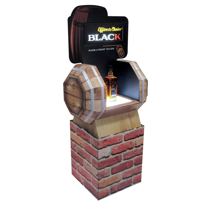
The semi- premium liquor consumers at retail were in for a pleasant surprise when they found this floor standing unit which resembled a real wooden barrel. Created by Jayna Packaging Pvt Ltd, the key brief from the brand was to create a barrel which communicated successfully with the help of an FSU. The Jayna team worked upon a design for a floor standing unit in which the shelf itself was in the shape of a wooden barrel thus communicating the brand theme directly. The design has three main elements. The shelf which, is in the shape of an actual barrel with a glorifier, the backlit header communicating the brand “Officer’s Choice Black” and the brick base on which the barrel rests……….giving the entire unit a very realistic and rugged look.
The material used for the entire structure is heavy duty corrugated board and acrylic for the backlit. The idea and challenge here was to make a unit out of corrugated board that was foldable, ensuring that the unit could be shipped in a knocked-down condition. Creating realistic graphics also played a key role in the success of the display. The final results were over whelming with a loud applaud from the client and demand for the second phase of production.
Blue Comfort
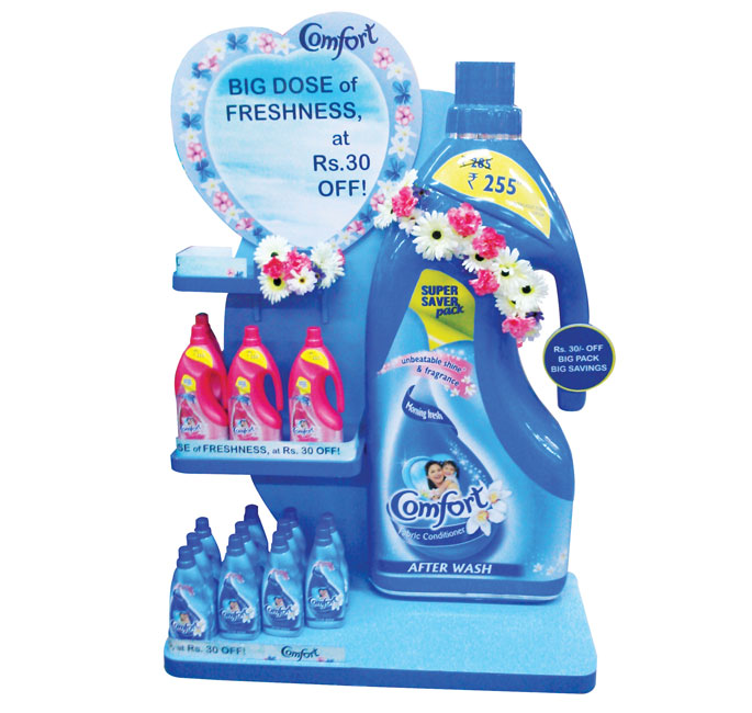
Comfort communicated their 30% off’ offer in style with an attractive floor display that conveyed freshness and softness. Constructed using MDF, the blue color theme with printed flowers was a refreshing eye-grabber at-retail. Holding more than ten SKU’s, the display was found in HyperCity Mumbai.
Garnier’s Power of 6
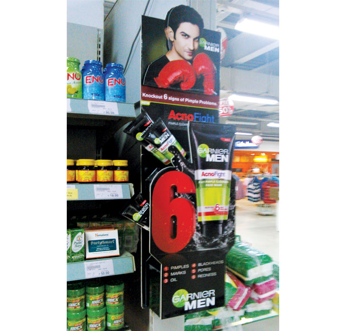
Made up entirely of Sunboard, the Garnier Acno Fight brand for men used a visual of actor Sushant Singh Rajput (the brand ambassador) posing with a boxing glove on this mini wing display found in HyperCity, Mumbai. Using its standard black and bright green colors, the parasite unit highlights the six causes of acne and how the brand helps in fighting them.
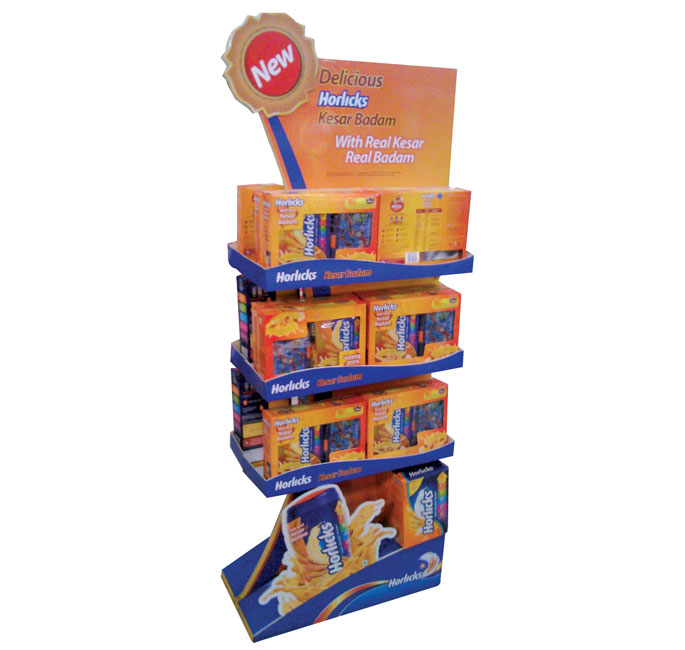
Flavoured Touch
Horlicks launched this orange and blue floor display to promote its new Kesar flavoured variant. The riser and all 3 shelves, which can hold 40-50 units, creatively promote the brand proposition. The display was spotted in HyperCity.
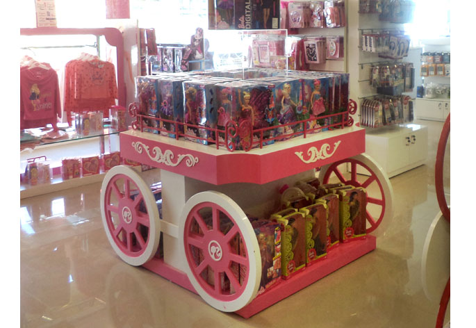
Fairy Tale Cart
Barbie continues to remain a fascination among young girls. Mattel just took this fascination to the next level with their new cart for Barbie dolls. Created by DMS Retail Works Pvt Ltd, the display is made up of wood and acrylic and is Duco painted. Harshada Gawde, from the DMS team, felt that the ‘Cart concept’ would do complete justice amidst the world of Barbie since the open brief from the client was to entice a young girl visually. The team also had to keep in mind the size constraint posed by a 4′ x 4′ unit. The demo showcase unit in the center is in clear acrylic. The top section and the space in between the wheels provide for stacking. When it was all said and done, the final design appeared like a cart right out of a fairy tale.

