As noted in Wikipedia…….April Fools’ Day is celebrated in many countries on April 1 every year. Sometimes referred to as All Fools’ Day, April 1 is not a national holiday, but is widely recognized and celebrated as a day when people play practical jokes and hoaxes on each other.
To honor the design fool in all of us, we have compiled a few examples of some interesting and creative design work that us “store-checkers” may not see out in the field everyday. There are a wide range of techniques and materials shown below as well as observational captions from our design peanut gallery.
No tricks, tomfoolery or funny stuff here…..check out the work below to see if you agree.
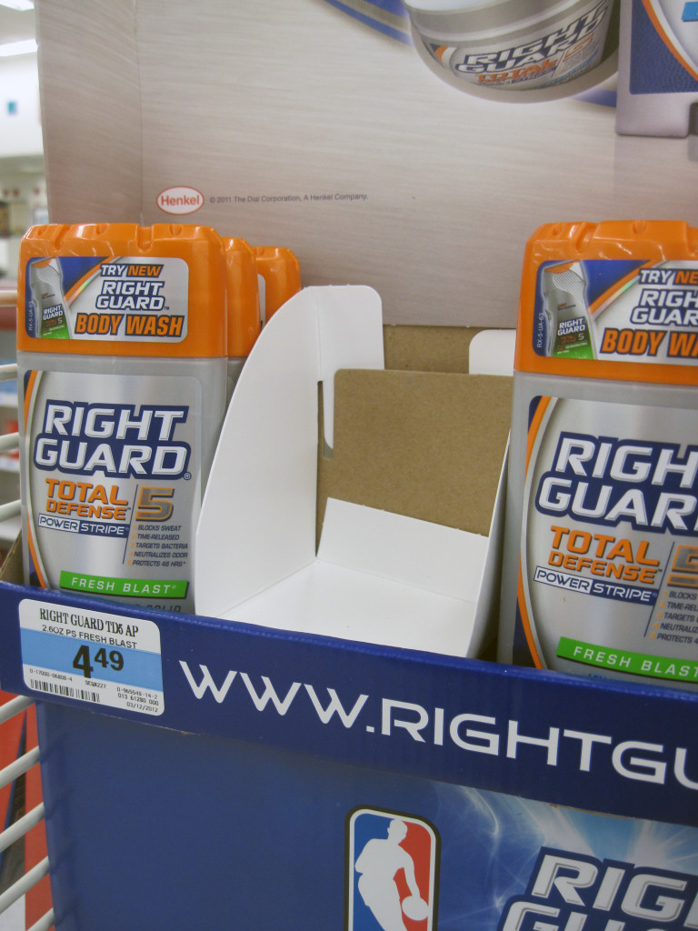
Paperboard Dividers
This Right Guard Total Defense sidekick incorporated a great way of keeping the deodorant products neatly separated during transit and shop-down. A series of folding carton (paperboard) dividers were designed to slot into the back panel of the product shelf making for easy assembly as well as a super clean finished appearance.
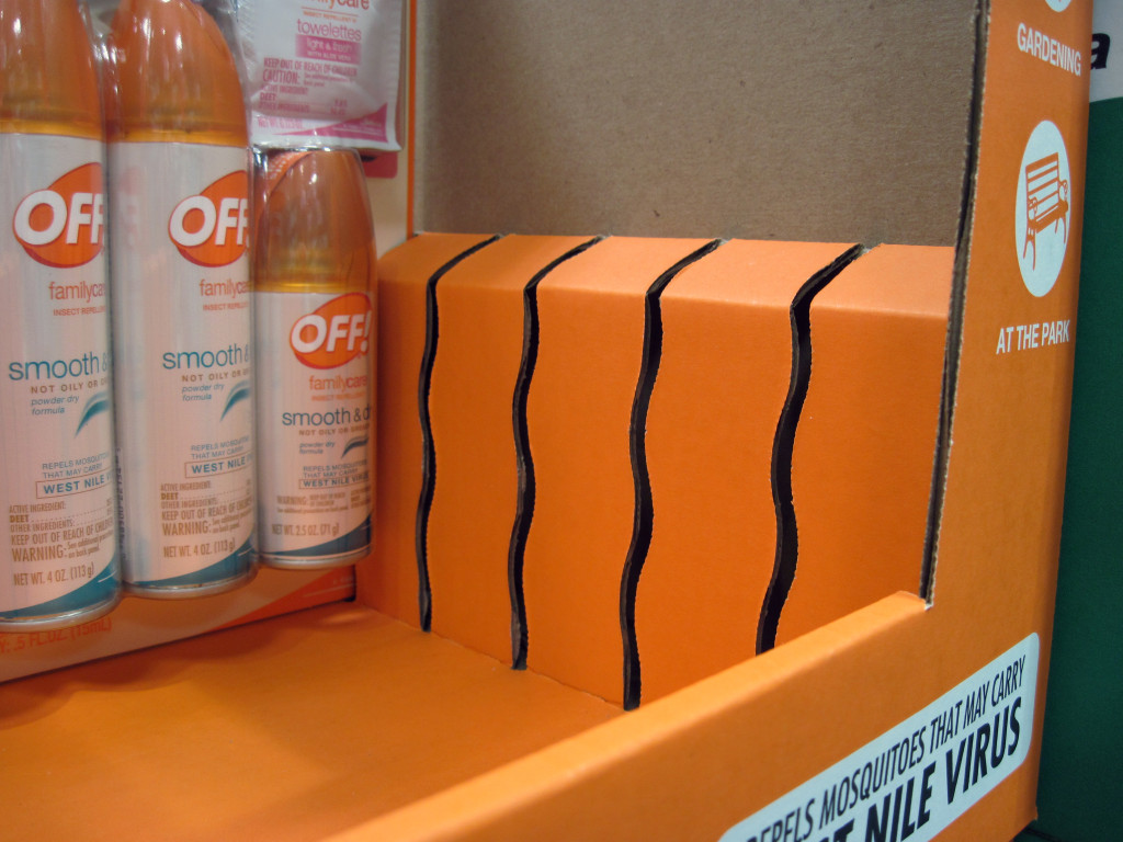
The Wiggle Slot
This design feature is popular with trapped blister carded products, especially in the club store environment. The wiggle slot serves two main purposes. First, it gives the product a lot of vertical stability as the outside edges of the backer card hit the curved crowns on the slots, maintaining it in an upright position. Secondly, a wiggle or staggered slot helps in the manufacturing process as it enables designers to create a wider slot that strips more efficiently and doesn’t hang up in cutting dies. We found another neat “trap door” slotting method that functions similar to the wiggle slot.
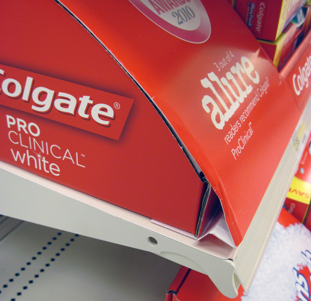
The Collapsible Front Lip
A few years back, all the rage at one mass merchant were extended front lips on end cap trays. From that trend, several really clever solutions emerged that gave brands a lot more visibility in terms of copy space. As time passed, retailers found these extended lips to be somewhat obtrusive to products on the shelves below so it kinda faded away.
The curved lip design shown above is the next evolution in expanding copy space. This design is scored so that it can collapse down for shipping. If you look carefully, the entire tray is wrapped with a paperboard graphic shroud which this front lip is part of. This scored lip achieves several things. One, the ability to collapse the lip ensures minimal damage in transit. Two, it eliminates the need for a shipping filler to protect the curved lip. Three, the full graphic wrap allows for the use of a “common base tray unit” and removes the need to litho label the tray, thus reducing a manufacturing process.
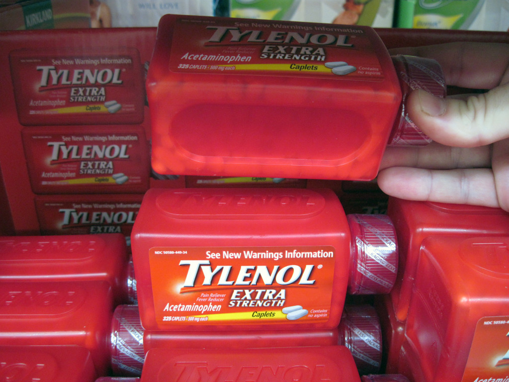
Stackable Product
This example involves both packaging and display. On occasion, packaging engineers sometimes overlook the downstream impact their designs have at retail, in particular, merchandising off-shelf with POP displays. In this case, the package designer/s created a clever and impactful method of nesting the bottles so that they formed a stable way (footprint) of presenting the product to shoppers. In addition, the bottle design eliminates the paperboard outer carton making it more sustainable and affordable in the cost of goods chain (COGs). Click here to view the complete image of the club shelf tray.
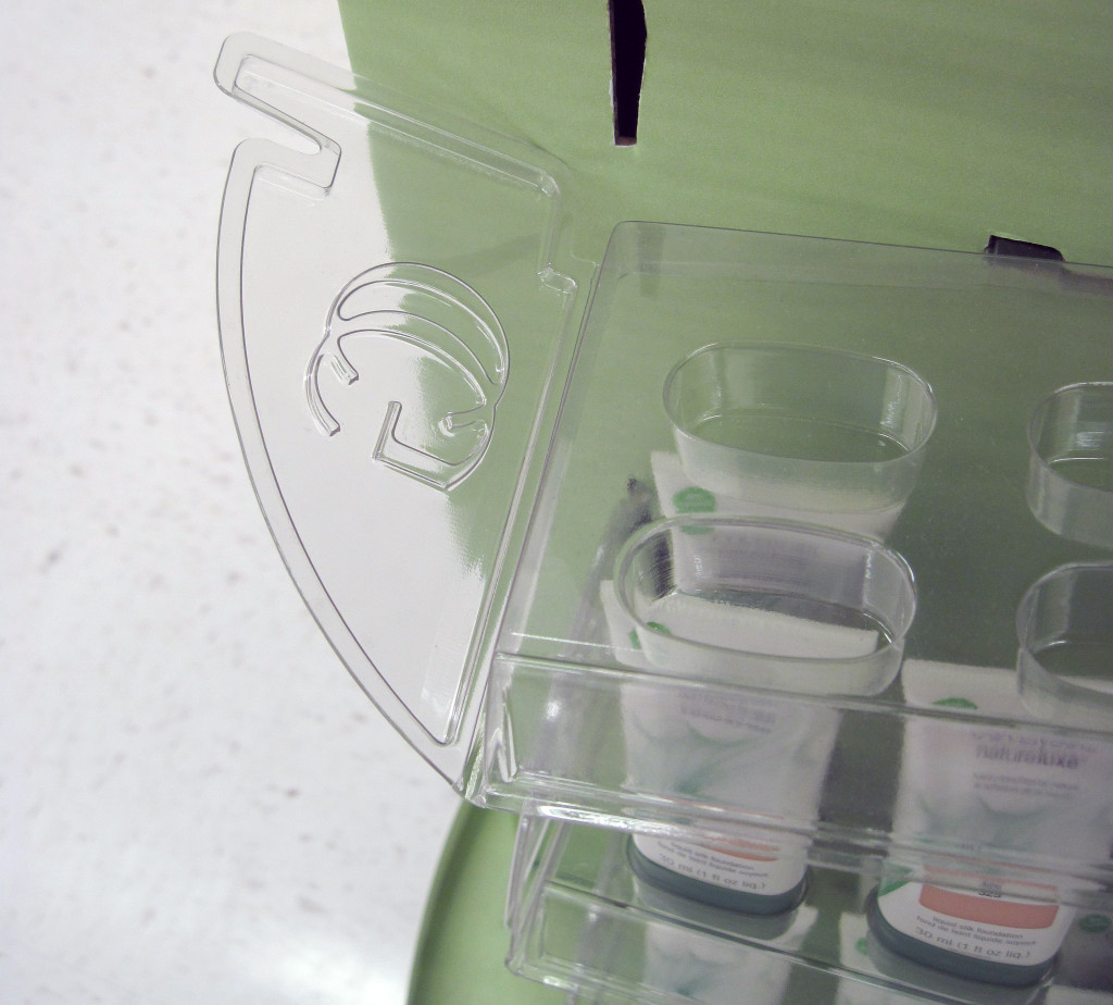
Hinged Vacuum Formed Tray
Popular in the cosmetic category, vacuum forming is a cost-effective manufacturing process used to create higher-end displays that can merchandise smaller sized products in stylish fashion. The image above is a good example of a clear vac-formed tray with hinged sides that offers full product visibility. As you can see, the designer incorporated hanging tabs to attach the trays to the corrugated structure and even detailed out the brand initials in the side panels.
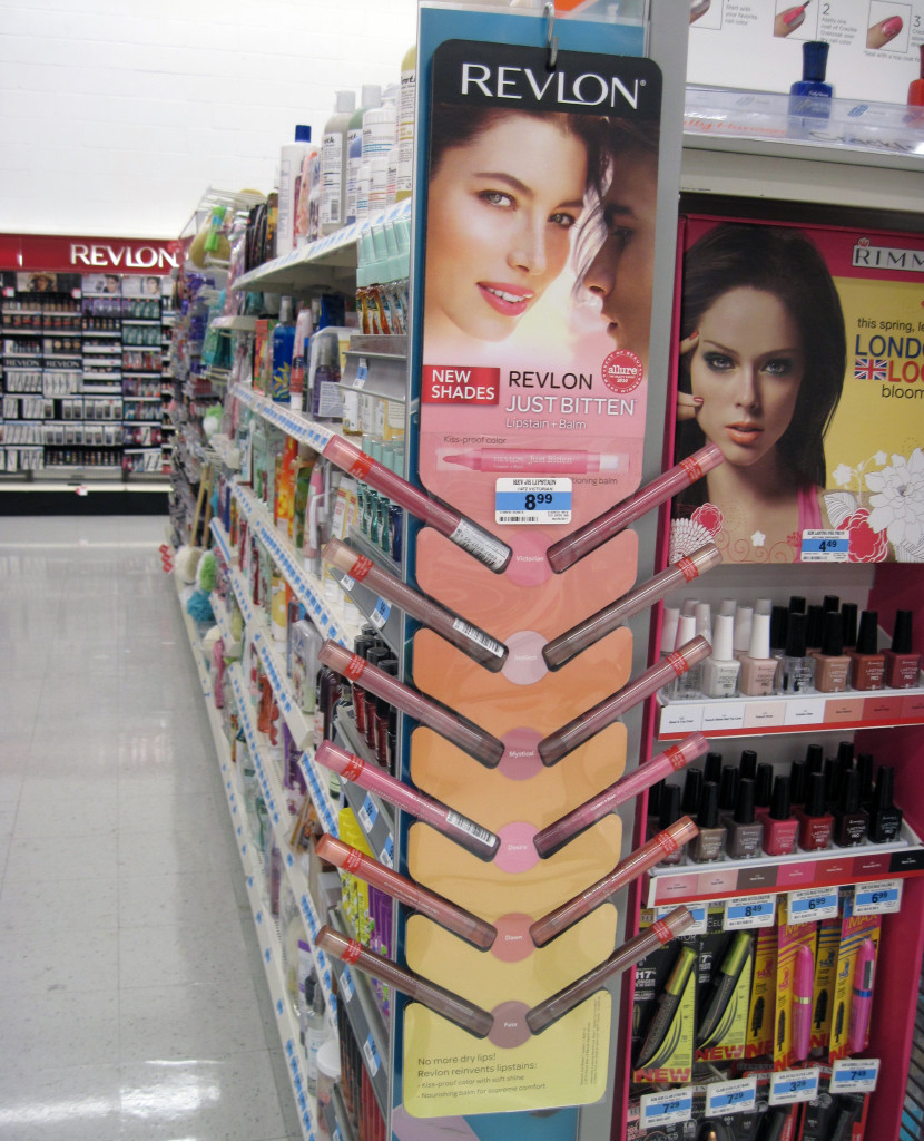
Clearly Floating
This design offers several insights. The first thing you should notice is how the products appear to be floating within the mini-wing display structure. Upon closer inspection, the design revealed how this was achieved. Layered foam core was die cut and shaped to create angled product cells which housed the lip balms. A clear outer substrate was wrapped around the main display body to retain the product while still offering full visibility of the skus. Pretty ingenious and “clearly” effective!
Hope you enjoyed some of these clever insights and should you have any of your own you would like to share, please do not hesitate to reach out and contact us.

