Effective branding is a key objective of any custom POP display. In a lot of cases it is not enough to let package branding speak for itself. Attractive and well appointed graphics that are integrated into a point-of-purchase display can help to reinforce the brand and ensure that the consumer walks away with a positive impression of the brand. Let’s look at 5 examples of custom POP displays that we designed for consumer products companies with a specific eye toward the role that the graphics play in capturing the attention of the consumer.
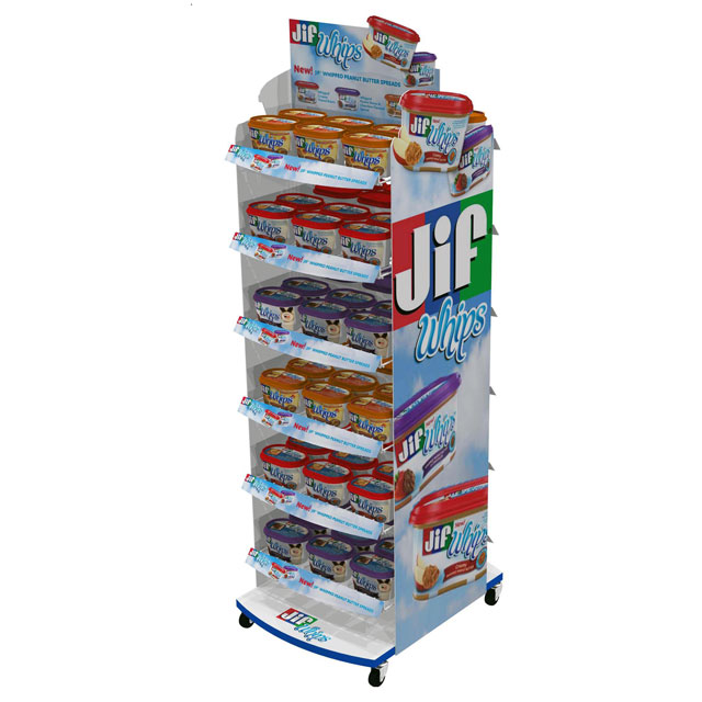
The first example is a two-sided, 12-shelf mobile freestanding display we designed for The J.M. Smucker Company. A quick glance at this fixture is enough to tell you why this display is part of a branding discussion. The focus of the entire display is the JIF brand. It would be hard to miss this display in a grocery store aisle and also hard not to see that the product is associated with the brand name JIF.
This is actually a simple metal tube and wire display with an MDF base, but it’s the graphics that make it come alive. We took advantage of branding opportunities on virtually every piece of display real estate available, starting with the silk screened base graphics and including the angled shelf graphics and the prominent die cut header and side graphics. These digitally printed graphics are also colorful which helps the display stand out at retail.
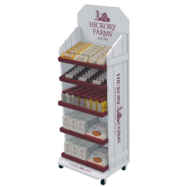
Our second example is a one-sided floor display we designed for Hickory Farms. This solid pine wood display was designed to create a “farm fresh” feel. With a painted white finish and contrasting red shelves, the one-color silk screened branding on the base, sides, and header was fitting for the display and for the brand.
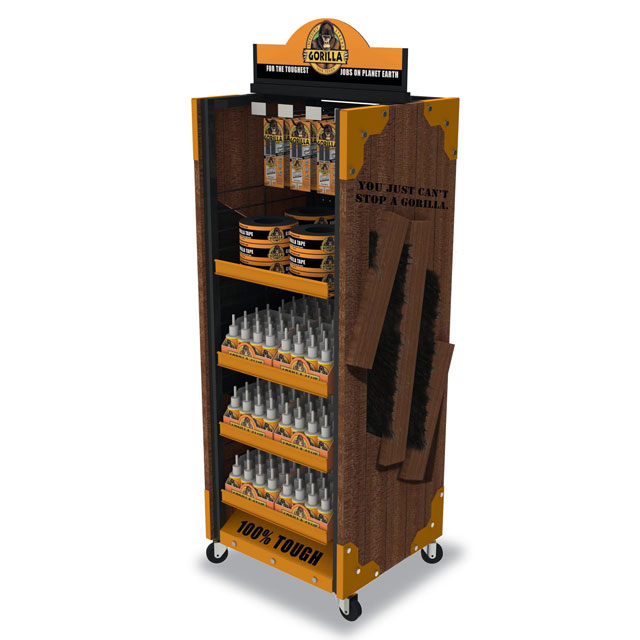
Our third example is a two-sided floor display we designed for Gorilla Glue. We used a metal tube and sheet metal frame construction for the body and 8 shelves and added hooks at the top for hanging product. We incorporated wood side panels with fake gorilla hair and used tag line silk screened branding on the base. The gorilla theme and powder coated orange shelves and accents were designed to complement the two-sided, die-cut PVC header sign which was the focal point of the displays branding.
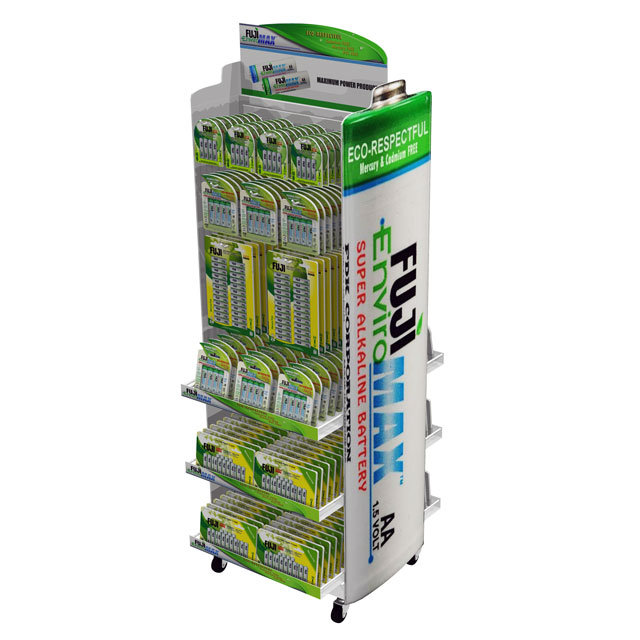
Our 4th example is a display we designed for Fuji Battery. Similar to the JIF display, we designed this two-sided floor display using a simple metal tube frame construction with wire shelves and hooks for hanging product. And, like the JIF display, what made this display stand out was the brightly colored die-cut graphics which we created in the shape of a battery on the sides. The colorful shelf graphics and die cut header sign served as unifying design elements and helped to reinforce the Fuji Battery brand.
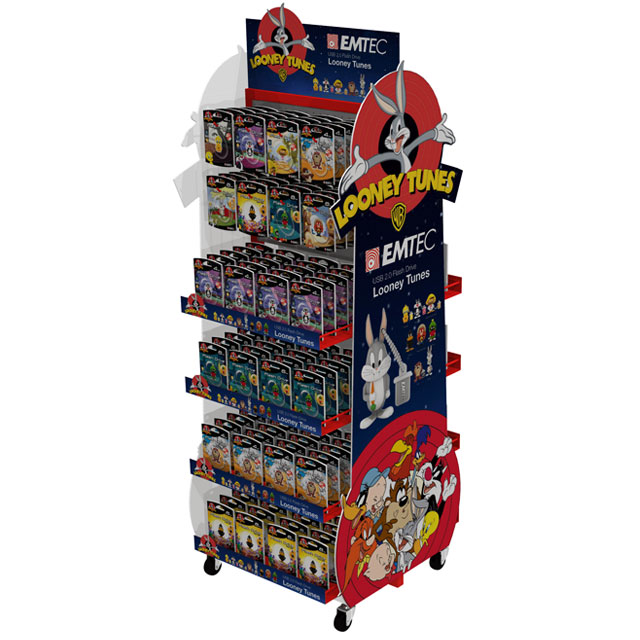
Our final example is also quite similar to the JIF and Fuji Battery displays. This is a display we designed for EMTEC which was a two-sided mobile floor display with a combination of shelves and hooks.
As with some of our other examples, the colorful and fun die-cut side and header graphics, together with the shelf graphics, were effective at making the display structure disappear and putting the consumer’s focus on the graphics and branding. In a store environment with lots of products and displays competing for shopper attention, this display grabs attention and invites you in to further explore the product while also reinforcing the brand identity.
For over 28 years, RICH Limited has been designing and manufacturing POP displays and store fixtures for more than 3500 customers around the world. Learn more about us.

